CONCEPTUALIZATION, REVITALIZATION
& RE-IMAGINATION
LOGO Design
& Visual BRANDING
In regard to logo design and a brands visual identity, think of a company, organization or institutions as a person on a dating website.
On most sites of this nature, the first thing you see is a photo of the person. If it’s a good photo it entices the viewers’ curiosity. If it’s an amazing photo, the viewer may engage eagerly. If it’s a photo that doesn’t really represent the person well, then the viewer may just move on.
Much like that photo, a company’s logo is often the first visual representation of that company a potential client or partners sees. It makes sense to take the time and make it not just a good representation, but an amazing one.
Below check out some AMAZING brands I helped visually craft.
AMAZING LOGOS, AMAZING RESULTS

Daily Body Restore™ is a Health & Wellness company focusing on a proprietary probiotic dietary supplement.
I was brought into revitalize and rethink the brand and wound up designing all of the companies materials. Bright logo in organic colors was quite the attention getter on big-box retail and pharmacy shelves in the United States and Canada.

Freedom Laser Therapy® was started by a nice guy who wanted to bring an internationally popular treatment for smoking addiction to America. It had worked for him and he was eager to share.
For his new company he wanted a simple logo with a wellness industry feel that could be used on a wide range of marketing material, products and operational elements (uniforms, wall art, mobile chairs, vehicles, building signs, and so much more).

Two guys starting a new company in a small warehouse in Southeastern Michigan wanted a logo that their small engineering, machine design and development company could grow with. Over 20 years later and that little company known as Michigan Custom Machines™ (MCM) has grown and excelled. The logo, as initially requested has grown with them.

An amazing client with a charismatic leader full of energy and the desire to execute at the highest level in an industry the requires over-the-top production value, GBK Productions™ created unique and amazing events that promoted luxury and unique product to celebrities at openings of star studded events like the Oscar’s, Emmy’s, BET Awards, Sundance Film Festival and numerous more. Often supporting charity events as well, GBK made a name for itself as the premier event company in Hollywood for nearly two decades and their logo was everywhere.
Great company, great team, amazing owner (you ROCK Gavin) and they deserved an amazing logo.

Franklin Fastener® engineered clamping solutions is a premier manufacturer offering wire forming, metal stamping, and a variety of other assembly solutions to build standard clamps and custom parts for customers across a vast array of industries.
They needed a logo that visually demonstrated their product, while still being proportioned well for web use.

A local fan favorite for years, Rosie O’Grady’s Irish Pubs were several locations that evolved when the owner of a singular “O’Grady’s” wanted to opens multiple locations with more of a sports bar feel and menu. I was given the honor of developing a new logo and brand specifications (maintaining the parent companies color specs) for the new restaurants. I was given the latitude to do what I felt was necessary to evolve the new visual identity to be bold, eye catching and target market appropriate.

GD Productions™ was a startup when I was asked by a colleague to develop a logo for her fledgling modeling agency. Fed up with agencies that treated models poorly, the owner decided to start her own. That was over two decades ago and the company has only grown since then.

Though a small project for a small startup, I always enjoyed the client and the designs I created for them. I still smile when I see the logo we came up with (every good logo is collaborative with the client – it’s their baby, pun intended).
So we talked over coffee, at length, and then I put her feelings into a visual representation so others could see the joy she felt as she created her products for the most fragile and wonderful of clientele.


My design for California BodyGlow™, a spray on tanning company in Los Angeles, was simple and clean based around a warm and inviting color palette. The photos here show the brand in use at a celebrity “gifting suite” for the Emmy Awards (photography by N. Prommer).
Show in the photos is a portable BodyGlow spray-tan booth at a celebrity event. One of the Los Angeles team was handing out branded gift certificates to some familiar Hollywood faces.
I would have loved to have done the logo as an applique on the pop-up both itself, but time constraints didn’t allow.


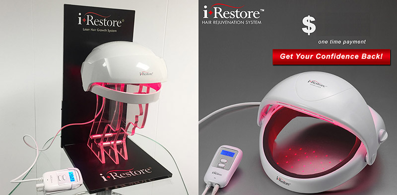
I was awarded The iRestore™ logo project after the success of developing the creative content for the Freedom Laser Therapy line. A product line spun off from the initial company, this product used similar technology but was targeted less to the Health & Wellness industry and more to cosmetic appearance.
Initially launched online and through print ads in publication like Sky Mall, it evolved into a more mainstream market and eventually made great strides after appearing on various reality TV and health talk-shows.
Feel Free to Reach Out
& Say Hello!
If your interested in me tackling a creative project big or small, send me a quick email. Have an amazing day!


